Thursday, January 31, 2013

Museum of Contemporary Art Cleveland by Farshid Moussavi

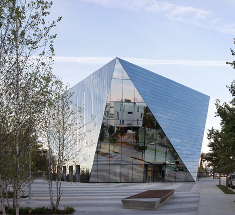
This six-sided building covered in mirrors is the new home for the Museum of Contemporary Art Cleveland in Ohio by London-based architect Farshid Moussavi (+ slideshow).
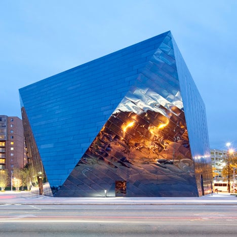
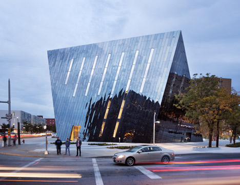
The four-storey building, which opened this weekend, features faceted walls clad in mirrored black stainless steel and replaces the museum’s former address in the loft of an old playhouse complex.
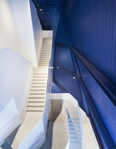
Visitors to the museum arrive inside a full-height atrium, where the structure of the walls is left exposed and the surfaces have been painted bright blue.
White staircases lead up to galleries on each of the floors, including a large top floor exhibition space where the ceiling is coloured with the same blue paint as the walls to offer an alternative to the standard ‘white-cube’ gallery.
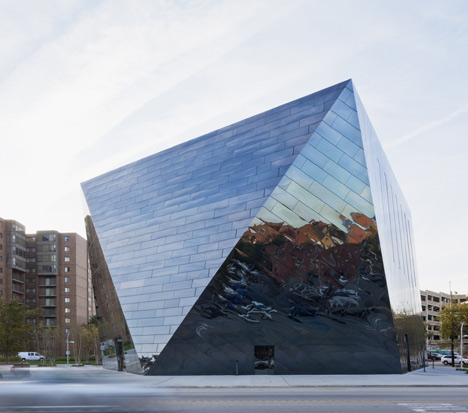
Located at the intersection of two major avenues, the museum faces onto a new public square by landscape architects James Corner Field Operations and has entrances on four of its elevations for flexibility between different exhibitions and events.
As the Museum of Contemporary Art Cleveland is a non-collecting museum, it places extra emphasis on public programmes and events, which will take place inside a double-height multi-purpose space on the building’s ground floor.
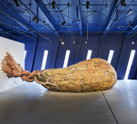
Farshid Moussavi Architecture completed the project in collaboration with architects Westlake Reed Leskosky, who are based in Cleveland.
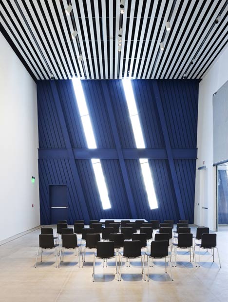
The museum first unveiled the designs for the building back in 2010.
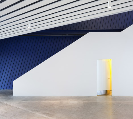
Photography is by Dean Kaufman.
Here’s some more information from the architect’s website:
MOCA is a 34,000 sq. ft. non-collecting museum in the emerging Uptown district of Cleveland’s University Circle neighbourhood. Located on the corner of a triangular site at the junction of two major roads, the building will act as a beacon for this area of the city.
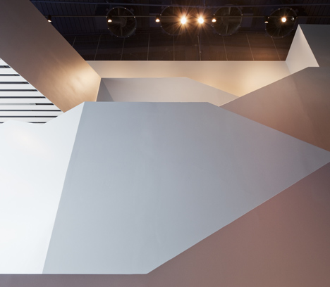
The new MOCA is arranged as a multi-storey building in order to produce a compact envelope and optimal environmental performance, and to liberate space for a museum plaza. The building in this location is exposed on all sides and has multiple entrances which will bring the museum added flexibility. Its prismatic form is clad in mirror black stainless steel panels which are arranged along a diagonal grid to follow the diagonal load bearing structure of the external envelope. These reflective panels will respond to weather changes and movement around the museum, providing visitors with constantly changing perceptions.
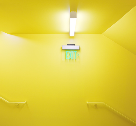
Upon entering the building, visitors will find the structure left exposed on the interior face of the envelope and treated with a fire-resistant, intense blue paint. The museum’s public and “back of house” activities will be interspersed along the section of the building and accessed physically and visually by a grand stair which ascends the museum’s vertical atrium. Each floor is designed to host a variety of configurations for maximum flexibility, with the blue inner surface which envelopes the different spaces providing a consistency across the various museum events. In the main gallery on the top floor, the blue surface will rise to form a deep blue ceiling, evoking the sky or a sense of boundlessness in contrast to the traditional idea of the gallery as a white, sealed, cube.
You have read this article Architecture / Cultural / Featured / Museums with the title Museum of Contemporary Art Cleveland by Farshid Moussavi. You can bookmark this page URL http://moderndeserthomes.blogspot.com/2012/10/museum-of-contemporary-art-cleveland-by.html. Thanks!

Museum of Contemporary Art Cleveland by Farshid Moussavi

source:alifesdesign

ASEMIC FOREST – Westbahnhof Train Station, Vienna. / Shahira Hammad, Egypt.

Our Friend "Shahira Hammad", From Alexandria, Egypt, Sent us her thesis for the “Excessive” Post-Graduate program at the University of Applied Arts in Vienna, 2012.


Her project was featured in other many design networks like "eVolo", "Archinect" ... etc., so that we liked to show you her beautiful work!
This is Shahira's Description, Read it to understand the project:
"This project represents my thesis for the “Excessive” Post-Graduate program at the University of Applied Arts in Vienna, 2012. We were asked to envision a new train station for Vienna, one that would either modify or replace the existing Westbahnhof train station.
I chose to keep the existing building, but to contaminate it with structures that would express a complexity that now is missing. My intervention was inspired both from Nature and Culture, and beyond its polemical characteristics it does intend to bring back what in science is called: Spontaneous Order.
This is not disorder in the common sense, although it could have this appearance.
It is, evidently, a reaction against excessive rationalism and rationalizations. Yes, it is excessive, but essentially it tries nothing else but to bring the complexities present in Nature into the urban fabric.
In a way my “project” is not really a “project,” since I let what I envisioned come into being “naturally,” almost by itself, expressing not only outer realities, but also inner ones.
We could say that maybe this is an Epimethean work, as opposed to being Promethean, that is, a work in which thought comes afterwards… so the relationship between cause and effect is circular, not linear…
All in all this is an architectural meditation on Time as well, since the structures I envisioned do reflect metamorphosis, the passage of Time, change, ephemerality and even decay… themes, again, neglected by conventional architectures.
If chaos is deprived of its negative connotations maybe we will have again the chance to reach the positive aspects of what is called “spontaneous order.”"


And now let you with the pictures

 Click above the pic, to see the full size., Courtesy of Shahira Hammad
  Click above the pic, to see the full size., Courtesy of Shahira Hammad


 Click above the pic, to see the full size., Courtesy of Shahira Hammad
 Click above the pic, to see the full size., Courtesy of Shahira Hammad
 Click above the pic, to see the full size., Courtesy of Shahira Hammad
 Click above the pic, to see the full size., Courtesy of Shahira Hammad
 Click above the pic, to see the full size., Courtesy of Shahira Hammad
 Click above the pic, to see the full size., Courtesy of Shahira Hammad
 Click above the pic, to see the full size., Courtesy of Shahira Hammad
 Click above the pic, to see the full size., Courtesy of Shahira Hammad
 Click above the pic, to see the full size., Courtesy of Shahira Hammad
 Click above the pic, to see the full size., Courtesy of Shahira Hammad
 Click above the pic, to see the full size., Courtesy of Shahira Hammad
 Click above the pic, to see the full size., Courtesy of Shahira Hammad
 Click above the pic, to see the full size., Courtesy of Shahira Hammad
 Click above the pic, to see the full size., Courtesy of Shahira Hammad
 Click above the pic, to see the full size., Courtesy of Shahira Hammad
 Click above the pic, to see the full size., Courtesy of Shahira Hammad
Credits and links:
University of Applied Arts Vienna, Excessive Postgraduate program
Head professor: Hernan Diaz Alonso 
Assistant professor: Steven Ma
DesignDaily Courtesy
You have read this article Architecture / DesignDaily Courtesy / Egypt / Excessive Postgraduate program / Featured / Parametric / VIENNA with the title ASEMIC FOREST – Westbahnhof Train Station, Vienna. / Shahira Hammad, Egypt.. You can bookmark this page URL http://moderndeserthomes.blogspot.com/2012/10/asemic-forest-westbahnhof-train-station.html. Thanks!

ASEMIC FOREST – Westbahnhof Train Station, Vienna. / Shahira Hammad, Egypt.

source:alifesdesign

New Kyoto Town House / Alphaville Architects


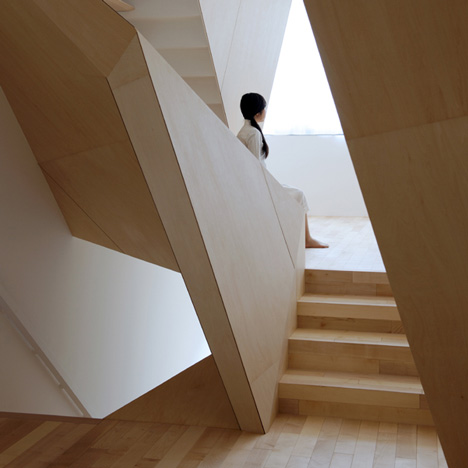
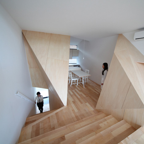
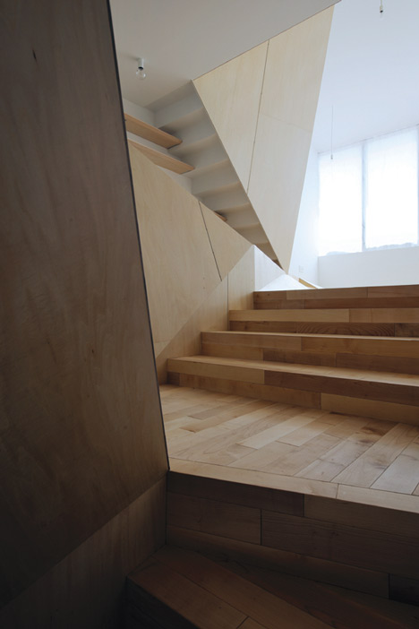
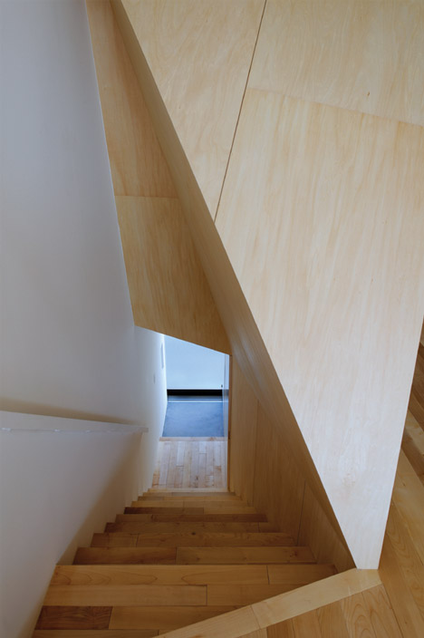
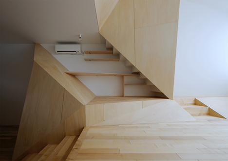
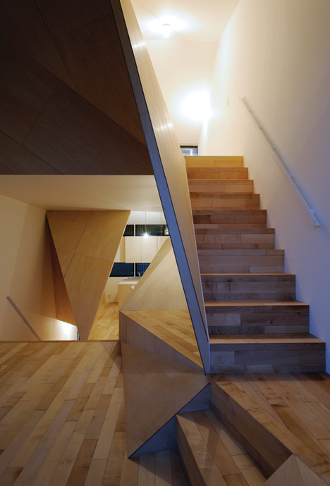
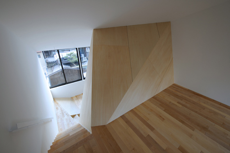
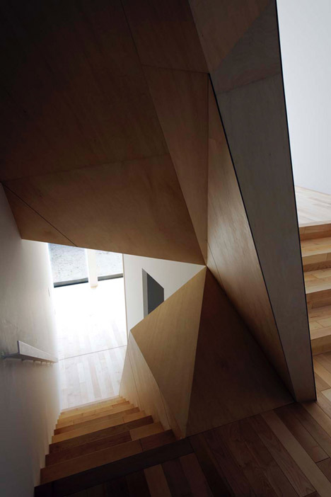
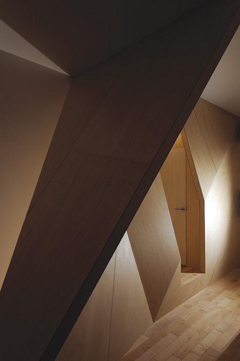
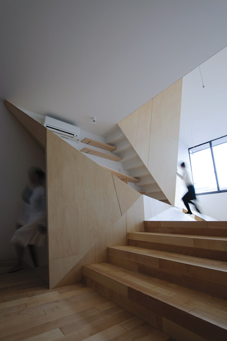
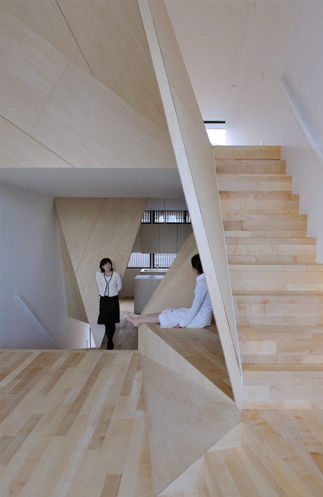
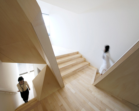
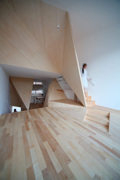
Faceted wooden panels divide the interior of this house in Kyoto, Japan, by architects ALPHAville.


The steel structure allows for an open interior where all floors are visually linked.


Photographs are by Kei Sugino and K Takeguchi.

The information that follows is from the architects:

New Kyoto Town House

The most characteristic feature of this house is the polyhedral form of the partition walls. They are not made by intuition but are based on logical concepts and perform multiple functions.


First, the partition walls, normally extended in the vertical and horizontal directions, have multidimensionality and loosely connect the rooms on the three floors.


The space thus created is one continuous room with dynamic nuances: it is simultaneously spacious and heterogeneous.


Second, the partition walls serve as reflectors of natural light.


They softly reflect the natural light coming from both the north and south sides and bring it to the otherwise dark interior of the building.


Finally, the partition walls blur the boundary between architecture and furniture, thus stimulating perception and behaviour.


Melt into floors and ceilings, the plywood-finished walls offer enjoyable experiences of touching and passing.


The house as a whole is a machine for living, like playground equipment.


Influence in Asia

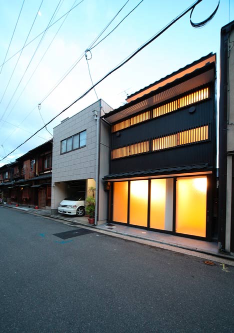
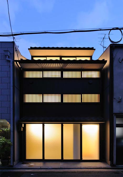
Because of the landscape regulations and the physical context of the neighbourhood, we inherited the traditional form and composition of townhouses. But at the same time, this house overcome the negative aspects of townhouses.


The wooden structure of townhouses cannot afford to have large openings on the short sides of the building as well as on floors. Consequently, the interior is dark and communications of people are limited to the horizontal direction.


In this project, it is the steel rigid frame and the polyhedral partition walls that enable to overcome the drawbacks of typical townhouses. Large openings on the walls and the floors, along with the partitions, allow natural light to diffuse multidirectionally, and encourage three dimensional communications and movements.


Freed from the constraints of the old system, occupants can have various relations with each other and place, and a new lifestyle in the historical area of Kyoto emerges.
You have read this article Architecture / Dezeen / Homes / Japanese Homes with the title New Kyoto Town House / Alphaville Architects . You can bookmark this page URL http://moderndeserthomes.blogspot.com/2012/10/new-kyoto-town-house-alphaville.html. Thanks!

New Kyoto Town House / Alphaville Architects

source:alifesdesign

Junta Castilla León by Alberto Campo Baeza


We raise high stone walls built of the same stone as the Zamora Cathedral, that follow the outline of the site, like a box open to the sky. We thus achieve a secret garden in which we conserve and plant leafy trees, aromatic plants and flowers. And we open openings in these stone walls that frame, from within, the cathedral, the landscape and the surrounding buildings. And in this verdant garden we build a transparent glass box that makes it seem as if one is working within the garden.

For the stone wall, qualities and dimensions were studied to express the strength of the stone in the same way as it is in the Cathedral. The same stone in large dimensions and with great thickness that accentuate the strength of the proposal. For the building itself, a glazed and perfectly controlled facade was conceived, with maximum simplicity in its construction system. The facade works actively in regard to the climate, able to hold in heat in the winter (Greenhouse effect) and at the same time to expel the heat and protect the building in the summer (Ventilated facade). It is a stone box open to the sky that holds a crystalline box and protects it and tempers it, immersed in the midst of a wonderful garden.

Offices for Junta de Castilla y León, Zamora, Spain, by Alberto Campo Baeza, In collaboration with Pablo Feméndez Lorenzo, Pablo Fledondo Diez, Alfonso Gonzalez Gaisan and Francisco Blanco Velasco
You have read this article Architecture / Featured / glass with the title Junta Castilla León by Alberto Campo Baeza . You can bookmark this page URL http://moderndeserthomes.blogspot.com/2012/10/junta-castilla-leon-by-alberto-campo.html. Thanks!

Junta Castilla León by Alberto Campo Baeza

source:alifesdesign