Saturday, April 30, 2011

My home for the weekend

Modern & Contemporary 

Living in Miami, Florida


I am staying in downtown Miami this weekend in a friends place taking care of his pets while he is away on business. I am writing about this because my friend has what i believe to be one of the most spectacular apartments in Miami. A one sort of Studio apartment but unlike 90% of studios its a modern marvel of perfect interior design, architecture, and of course the furniture and exquisite art work found within the apartment. 


And then of course there is the view of downtown Brickell and Miami, which is spectacular to say the least. The centerpiece of the apartment is a lit glass wall in the kitchen that is absolutely amazing and is one of the first things you see when you walk in. This leads into a living room sitting area that is spectacular followed by the bedroom area which sweals itself off by automated moving rolling white curtains. 

Of course this apartment is not made for those of us who have kids or big families, its the perfect Bachelor pad or someone single and no kids because as many of you know having this type of apartment and kids most likely will not work. This is an apartment in a city where fun is the thought of the day and tourism and young hip crowds rule the day. 


And remember the view I mentioned earlier, well wait till you see the balcony and the way it is furnished and way its laid out. All said, this is the perfect Miami home with the perfect design, interior, and equipped quite nicely. Please see the pictures found below.

Enjoy the following pictures of the perfect bachelor pad apartment

Kitchen and kitchen sitting area
Living room area from the bedroom

Living room looking out toward the balcony

Looking toward the kitchen from the living room area


Sitting area looking toward the door

Another View of the sitting area leading into the balcony

The Bedroom

The Center piece wood wall that separates the kitchen and living room area 


Looking out toward the south and the suburbs of Miami

The view as the sun come up over downtown

With daylight the entire apt seems to glow

Looking at the kitchen and living room from the bedroom


Simply stunning, amazing, breathtaking.. Living the life in Miami and enjoying the beautiful view,

AG Home Goods
(Alex Calzadilla)

Home Office Desk: Logan Office Suite

Home office desks furniture

$3,049.00 – $3,949.00
Overview:
Our Logan Collection has the look and feel of built-in cabinetry. Each piece of our Logan Office Suite is finished both inside and out. Our range of versatile pieces allows you to design your space for the ultimate in display and storage.
  • Medium Office Suite: 110" wide x 23.5" deep x 75" high
  • Large Office Suite: 134" wide x 23.5" deep x 75" high
  • Desk has a spacious top that rests on one file cabinet and one CPU cabinet with an adjustable shelf.
  • The base cabinets and open hutches each have one adjustable shelf.
  • Wood swatches, below, are available for $25 each. We will provide a merchandise refund for wood swatches if they're returned within 30 days.
  • Catalog / Internet Only.
Via: potterybarn

Friday, April 29, 2011

Tug of War: Which Sectional Would You Choose?

We have got a new tug of war this week between two great new sectionals. The all-modern and divine Stefano or the radiant and oh-so-beautiful Gramercy. Both of these sofa's are phenomenal and you can't go wrong with either of them. They are bench-made in the US of A, they are made of hardwood frames that will last you till the year 3011, and they make you want to grab your snuggie and settle in for a movie night. Although they are both amazing, they do have their differences. The Stefano can be described as contemporary with it's clean lines and metal legs. The Gramercy is more transitional which is still modern, but it gives you some of those traditional elements as in the nail head trim and the multicolored pillows. Don't be shy, hurry up and let us know which sectional suits your ravishing style so that you will be entered for the chance to win a gift card for your next purchase at High Fashion Home. Click here to enter on our Facebook page.


The Stefano
 
The Stefano is no foreign friend to contemporary luxury. It is upholstered with a beautiful fabric that will glow in any space. Not only is it delightful to look at, it is also cozy for any gathering you plan to have.

The Gramercy
Never Boring, the Gramercy sectional's high sheltered arms and abundance of pillows presents a new approach to sectionals. It has spacious seating for intimate gatherings and enough comfort for the company you welcome. A nice nail head trim brings in some traditional aspects, but it still has a modern touch.


MODERN CONTEMPORARY KITCHENS FROM POLAND

POLISH MODERN, CONTEMPORARY KITCHEN DESIGNS


black kitchen 


20 years ago if you had told the polish people  that they would today be designing kitchens like these they would have laughed in your face as they were worried not about the looks of their homes but by the food they would eat that night, how they would feed their families, and how they would get cooking oil for the long Polish winters, brutal by Western Standards, even harsher with the living conditions suffered by the polish people at the time. A country once an industrial giant its cities were now concrete like structures, gloomy, dark, and style, well that word was not used. Forward twenty years from the fall of the Easter European Communist bloc countries and today Poland looks nothiong like it did back then. Modern, Contemporary gleAming skyscrapers have replaced the old buildings, ultra luxury town homes and lofts have replaced the old soviet style apartment block complex and the country's economy is back on track. Now considered to be hip and modern by anyone's standard I was very impressed to see such a big design studio on Kitchens based out of Poland. From communist low level un-noticeable blocks to the modern contemporary glass designs of today, My GOD freedom brings many many things...

Kitchen Inspiration

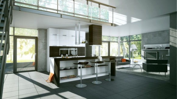
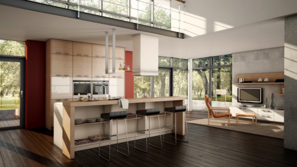
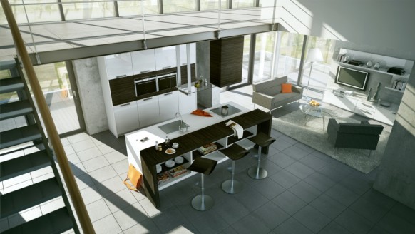
Today we feature the work of Meedo, a Poland based design studio that specializes in architectural visualization. They have an impressive portfolio and we thought the kitchens were especially well put together. While most of these renderings wouldn’t pass for photorealism, some of them feature solutions for spaces that are ‘life-like’ (read short-on-area). They also show off open living concepts and there are even one or two images that portray one room living.


Y5T47N8
open kitchen living
open kitchen
modern kitchen fancy lighting
stylish kitchen traditional
white island kitchen chandlier
kitchen chandlier
white wood green kitchen
white kitchen blue accents
red kitchen
single room living
kitchen biege wood accents
modern style kitchen
black red kitchen
kitchen dining
artistic kitchen
traditional kitchen
modern white kitchen wood        


 AG HOME GOODS ... 

Thursday, April 28, 2011

Before and After: From Driveway to Gravel Garden

Sometimes it takes years of thinking before making a big change.

The area of disappointment was supposed to be a guest parking area separated from our concrete parking pad with an island garden bed. On the other side, there was just a narrow strip of garden due to the installation of a dry stream, necessary after torrential rains washed out all of the original driveway gravel in our first year.

No matter what we planted on either side, the area just never looked inviting because the plants struggled. It's a difficult site for plants. A hot, southwest exposure, but too wet in winter for drought-tolerant plants, led to losses every year. Replant. Repeat. Something else had to be done!

BEFORE: (View from driveway)
Starting in 2005, we tried plantings on either side.
Photo is from 2008 and the third iteration of failed plantings.

In 2010, we began removing plants in preparation for this big project. We weren't sure exactly what we would do. We drafted many ideas on paper and I searched through volumes of garden and landscape books and magazines. We thought about raised beds and a formal parterre, but that would eliminate the parking area. 


Out of our 2010 ideas, we decided to extend the row of hollies (ilex cornuta 'dwarf Burford') along our garage wall to form a hedge along the concrete side of the island bed. When the new hollies reach the size of the existing hollies, we'll have a nice "green fence" to serve as a backdrop.


Throughout our travels to Europe, we realized that in many areas, unable to grow lawns due to lack of rainfall, gravel is used throughout garden areas. Drought-tolerant plants were "mulched" with gravel. There is often no separation between garden/yard, parking areas and entertainment areas. The gravel covers the ground, integrating all the elements. The result is a simplified design.

Gravel is permeable, allowing rain water to reach the soil beneath. With land properly graded, the gravel doesn't wash away during rainstorms. Selecting a locally quarried gravel reduces the cost as well as making the selection "green" since it is not hauled in on trucks from long distances.

Garden inspiration:
Gravel used to integrate garden, path and patio.
Tractors drive on the gravel for tending this garden
at Chateau Val Joanis in France.
April 2011.
Returning from France on April 17, we decided to tackle this project once and for all. I pulled out an English garden magazine that had more photos of gardens mulched with gravel. We hopped in the truck and drove a few miles to our local provider of gravel. We decided to use the same driveway gravel that is standard in our neighborhood so that we wouldn't have to seek approval from our Homeowner's Association. The blue-beige gravel works well next to our sidewalk flagstone and the river rock used in the dry stream and French drain. Our French drain, installed in March 2010, was necessary to prevent erosion of our driveway gravel.

We arranged for screenings, a finely ground gravel, to be delivered (by dump truck). We used the screenings to build up the grade and level the area (with slope for drainage) to prepare for the blue gravel.

BEFORE: (View from front sidewalk)
Gravel parking area after plants
removed from each side.
 Landscape fabric pinned to the ground for patio installation.
April 20, 2011.
For the area to be welcoming, we installed a patio made of pre-formed concrete squares (16 inches square) on top of landscape fabric (to prevent weeds) and the graded screenings.

Opposite the patio, across the "parking area" section, I planted a row of rosemary to make a fragrant, low hedge. Rosemary is often used in xeric settings and can take the sun. The gravel will actually help prevent rotting of the drought-tolerant plant. I dug a trench, mixed in soil, gravel and compost before planting the rosemary in their biodegradable pots.

Once the patio was installed and we had graded the rest of the area with the screenings, we had a dump truck deliver the driveway gravel.

We raked the gravel around the new rosemary and the existing buddleia, hollies (future hedge backdrop), crepe myrtle and large, oakleaf holly.

This project solves a number of problem for us. It reduces maintenance of the area while unifying the garden, driveway and guest parking area. The simplicity of the design cleans up the entrance to our house, making it apparent that guests should enter at the front of the house instead of the side door. Finally, the materials used minimize plant watering while allowing rainwater to soak into the soil below the gravel.

AFTER: Gravel used to integrate parking with garden.
Small patio installed for a welcoming bench and containers of xeric plants.
Space to park a car.
Just waiting for the holly hedge to grow to full size.
April 28, 2011.
AFTER: (View from driveway)
Note the hollies against the garage wall.
The same hollies are planted behind the bench area and
will eventually create a green hedge.
April 28, 2011
With all of this gravel, there needed to be a "welcome" area. We moved an existing bench to the patio and collected our spare containers. We had two matching containers for each side of the bench, so we purchased two more to make a trio of planters on each side of the bench. We used a square stepping stone (on hand) to elevate an existing container to make it higher than the urn container. (I will pick up a round stepping stone on my next trip to a garden store to make the elevation material less noticeable.)

In the largest, elevated container, I planted blue point juniper (juniper chinesis 'Blue Point') because it is drought-tolerant and does well in containers. Since the juniper is suitable for zones 4-9, it can handle our cold winters in zone 7b, without being taken indoors. Someday, the juniper may outgrow the containers, but that will be many years. Juniper is deer resistant unless there is a shortage of winter food. Being evergreen, I don't expect a problem with regrowth if there is any nibbling.

The urn containers were planted with English lavender (lavandula angustifolis). Again, for drought-tolerance and cold-tolerance, this plant is suitable for zones 5-9. Lavender is deer resistant.

Finally, the low "bowl" containers were planted with succulents. I used "hens and chicks" (sempervivum) and sedum as my experience with these for container plantings in 2010 were quite successful, having wintered well and required minimal water and no replanting for 2011.

This project took about 8 hours of time with two of us working. Raking screenings and gravel was tiring, heavy work, but easily a DIY project. We used four yards of screenings and five yards of gravel because it extends onto the driveway. We will use another five yards of gravel to finish dressing the entire driveway.

The patio, made of pre-cast squares, didn't require special skill beyond leveling. We minimized the expense by using existing containers and bench and using local sources for the all materials.

While I would like to paint these containers and bench in colorful colors to hide the bland brown, that idea was vetoed by my husband! I think a deep purple, matching the lavender blooms, would look great on the urns, don't you?

Containers of drought-tolerant plants
include 'Blue Point' Juniper, English lavender
and sempervivum with sedum.


Words and photos by Freda Cameron, Defining Your Home, Garden and Travel. All company or product or patented names mentioned are registered trademarks, copyrights, or patents owned by those respective companies or persons.

Miami Real Estate Market Update

Miami Real Estate
Photo courtesy of Lenny Furman

Miami real estate asking prices are still too high, and sellers still don’t get it. If one drives around Miami Beach, or Coral Gables, particularly in those areas where luxury homes are located, it becomes painfully obvious that there are almost as many homes for sale now as there were in early 2009, when the real estate market in Miami took a deep dive.

Many homeowners who want to sell, but whose homes are not up for sale, report that they are waiting for the market to change, before they place signs in front of their houses. They feel as though they will not be able to get what they consider to be a good price for their property if they try to sell now.

The reality is that they are not going to be able to get what they consider to be a good price, whether they wait or don’t wait, because the fact is that sales prices are where they should be.

Prices that homes were selling for in 2004 and 2005 were so inflated that when the bubble finally burst, almost everyone was shocked, and now in 2011, sales prices of single family luxury homes are more or less the same as they were 7 years ago -- exactly where they should be.

It is understandable why sellers are frustrated, because in America real estate is supposed to appreciate, and if prices are the same now as they were so long ago, it is very hard to accept. However, if homeowners who want to sell, come to the realization that 2004 and 2005 home prices were based on greed alone, and not on value, it may well become a little easier to accept.

Realtors are also very much to blame for the frustrations of homeowners, because in their zest to get a listing, they tell a homeowner whatever he/she wants to hear, in order to secure the listing. The owner, of course, believes the realtor, gives the agent the listing, and then becomes extremely frustrated, when 6 or 12 months pass by, and the seller receives no offers on the property.

What is the answer? It is very simple. Realtors need to tell the truth to homeowners, and homeowners who want to sell must necessarily become a lot more realistic than they are.

If anyone doubts the veracity of what is written here, one needs only to look at the facts. Here are the most recent statistics of home and condo sales in the Miami area.


Miami Real Estate Statistics

design interior

Home Design interior design ideas, interior designs, home design, design ideas, interior design trends, home interior ideas, home interior, room design ideas, interior design, living room design, bedroom design, kitchen design, bathroom design, home office design, decorating child rooms, design a room, furniture design, interior decorating, home ideas, architecture, design tips, house decorating, home improvement, apartment decorating, kitchen counter-top, kitchen furniture Some other useful related links,photos and websites has been classed here.
Best Home Design For Pet – Modern Contemporary Design – modecodesign.
Home design 2 Home Design
I LOVE ICE CREAM! « Kymlee: Life Story
Home design 3 Home Design

Luxury Contemporary Wooden House with Classic Style Home Design …
Description : Luxury Contemporary Wooden House with Classic Style Home Design Design Decoration for Contemporary home designs, Wood house designs. Describe Her.